EADA Whiskey
This team project was the winning entry in a competition run by Bord Bia (Irish Food Board), the Irish state agency in charge of promoting Irish food, drink and horticulture on both a national and international scale. In 2019, Bord Bia were working with a number of Irish whiskey start-ups that needed help with branding, so they asked Visual Communication Design students at IADT to design a “template” for whiskey brand guidelines, based on a hypothetical distillery located in Athlone.
Collaborator: Emily Torpey
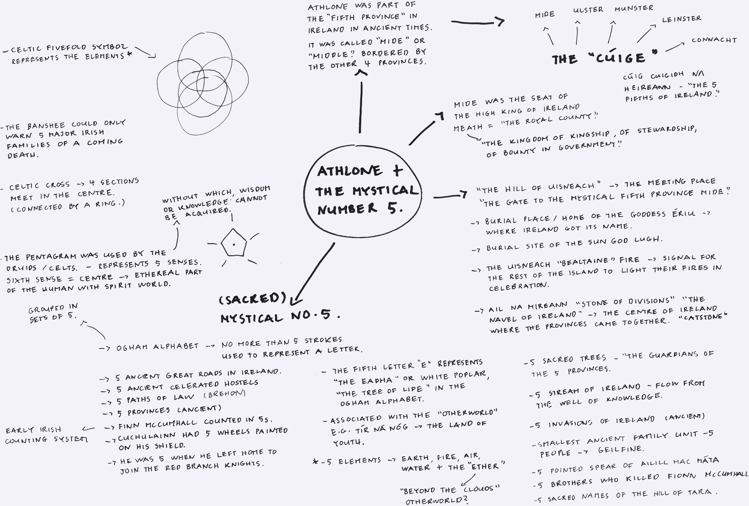
Mindmap of Athlone's mythology
Brand Concept
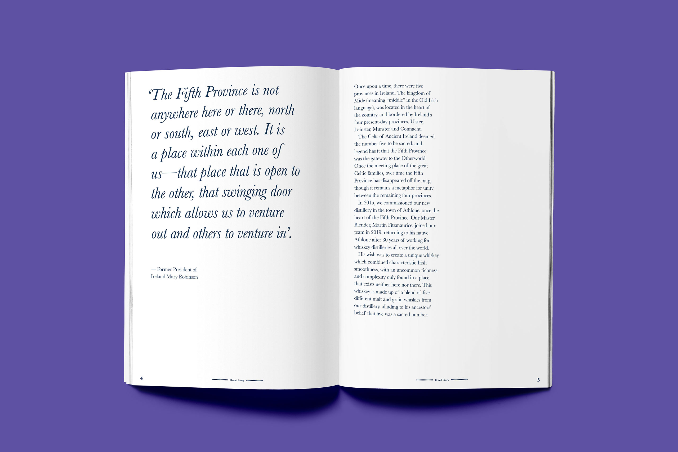
My project partner and I did extensive research on the history of Athlone, hoping to find inspiration for our hypothetical whiskey brand. We discovered that the town was once the heart of Ancient Ireland’s Fifth Province, a central province that the Celts deemed to be sacred because they believed that five was a sacred number. We thought that the mythology surrounding the Fifth Province could be used to create an intriguing brand story, and decided to explore it visually.
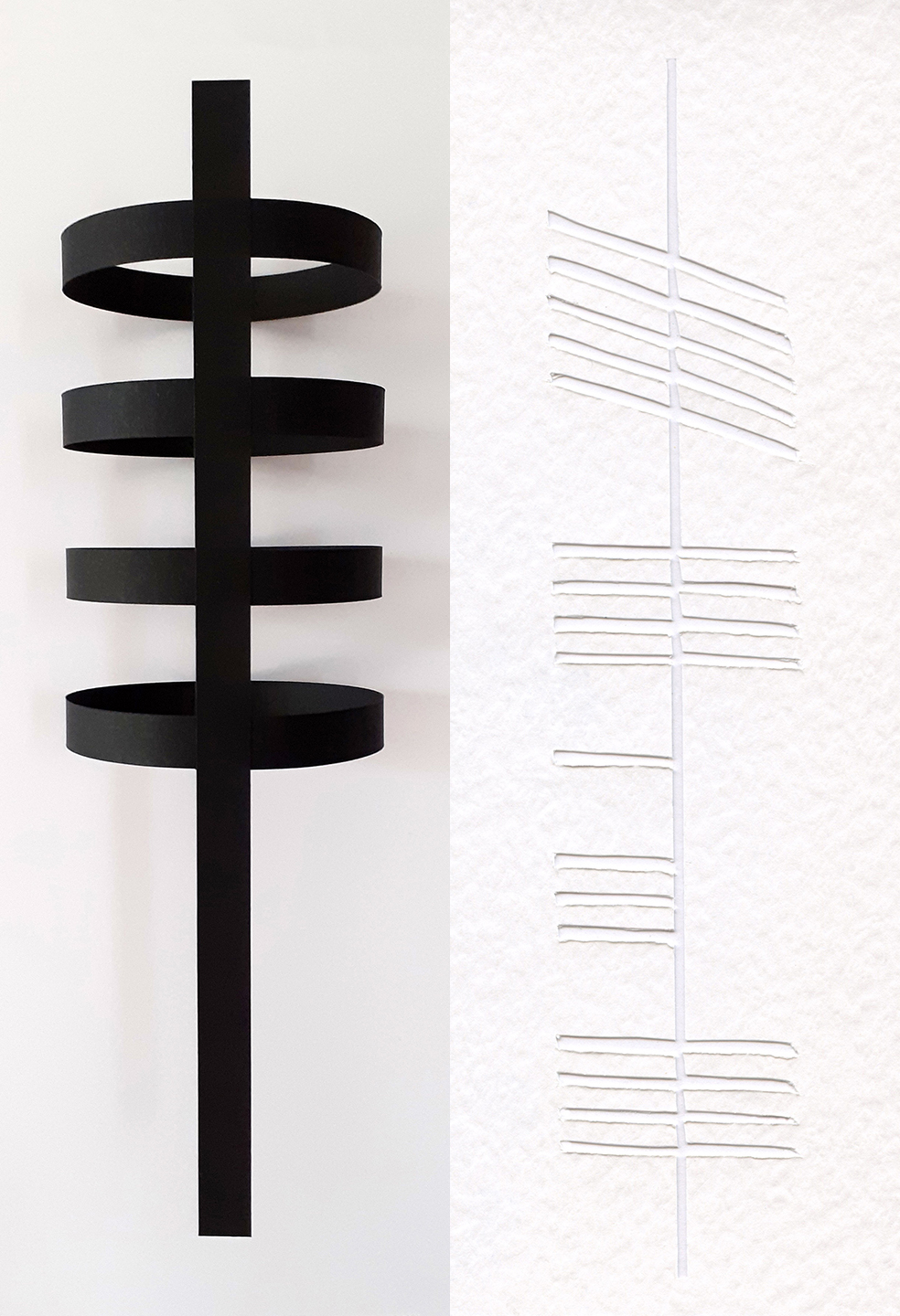
Image-making examples (Grace)
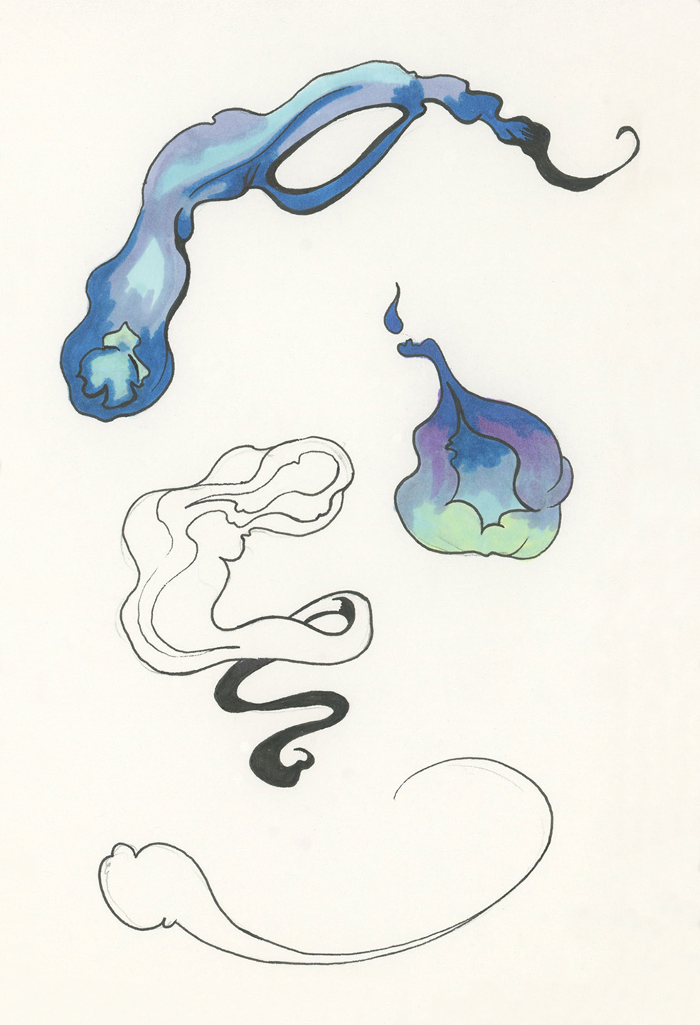
Image-making examples (Emily)
Image-making
My visual explorations were inspired by the letter Eadha (E) of the Celtic Ogham alphabet, which I interpreted as a visual representation of Ireland’s five ancient provinces. Eadha is also the Irish word for the poplar tree, nicknamed “The Whispering Tree” by the Celts for its alleged ability to convey messages from the Otherworld, a supernatural realm that could supposedly be accessed via a number of “gateways” located in the Fifth Province. My partner’s visual explorations were inspired by the flame-like “guardians” of those gateways, the Will-O’-Wisps.
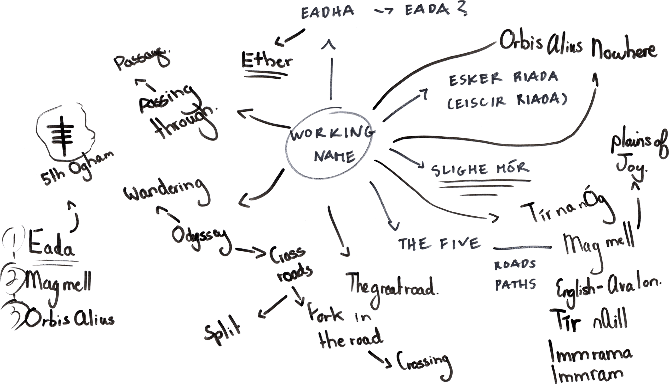
Mindmap of possible brand names
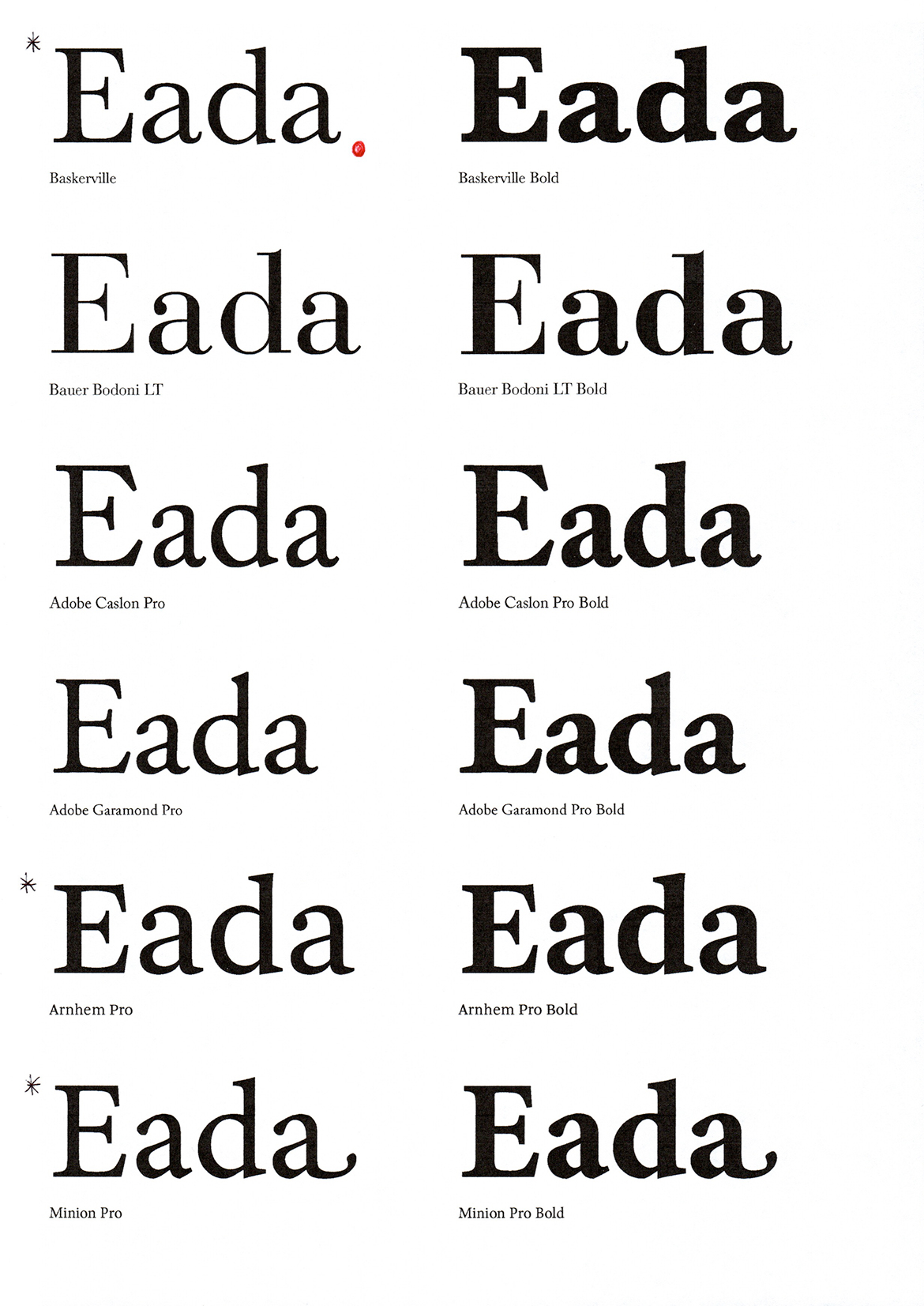
Type tests for EADA Whiskey
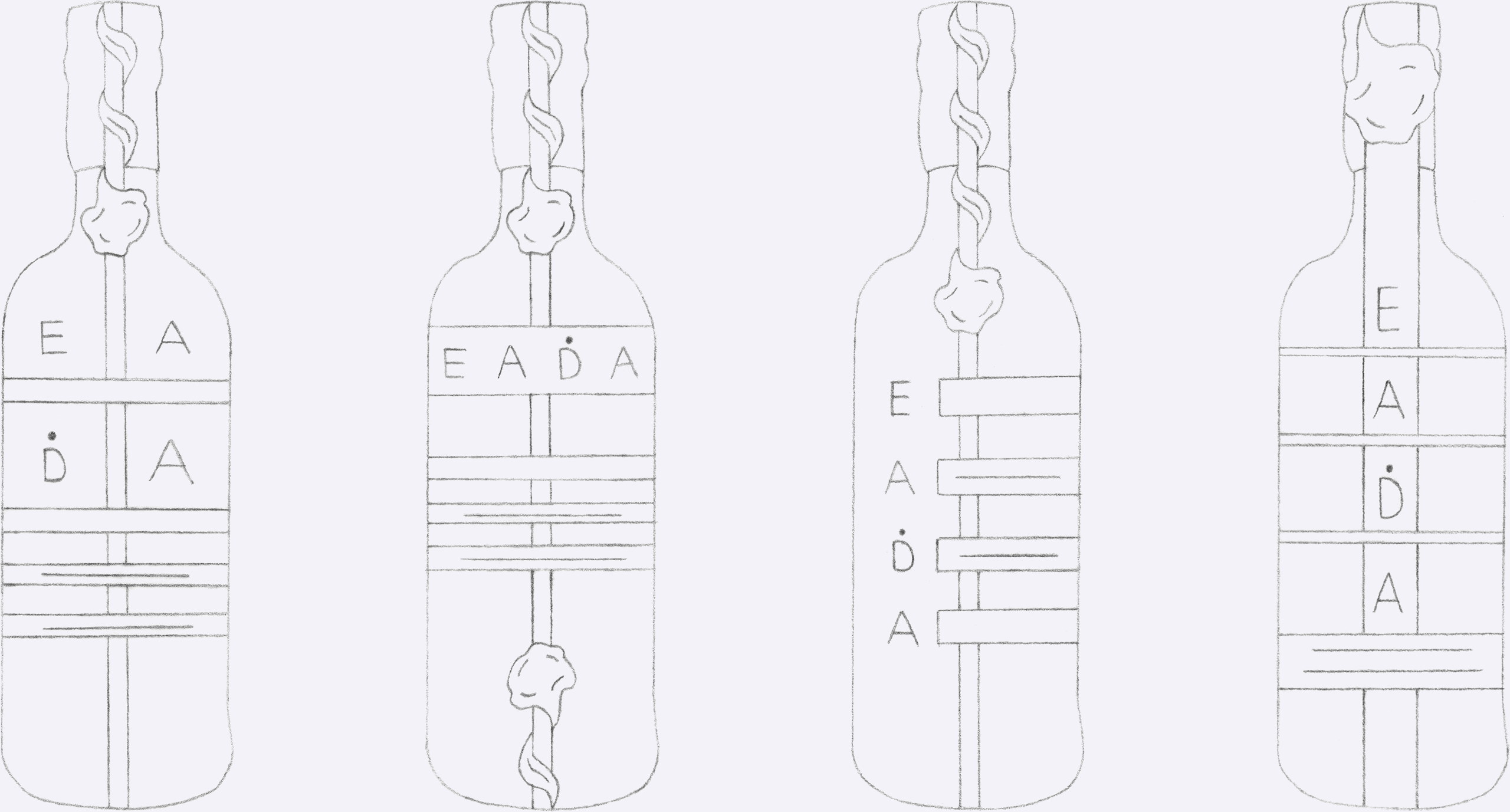
Logo tests for EADA Whiskey
Typography
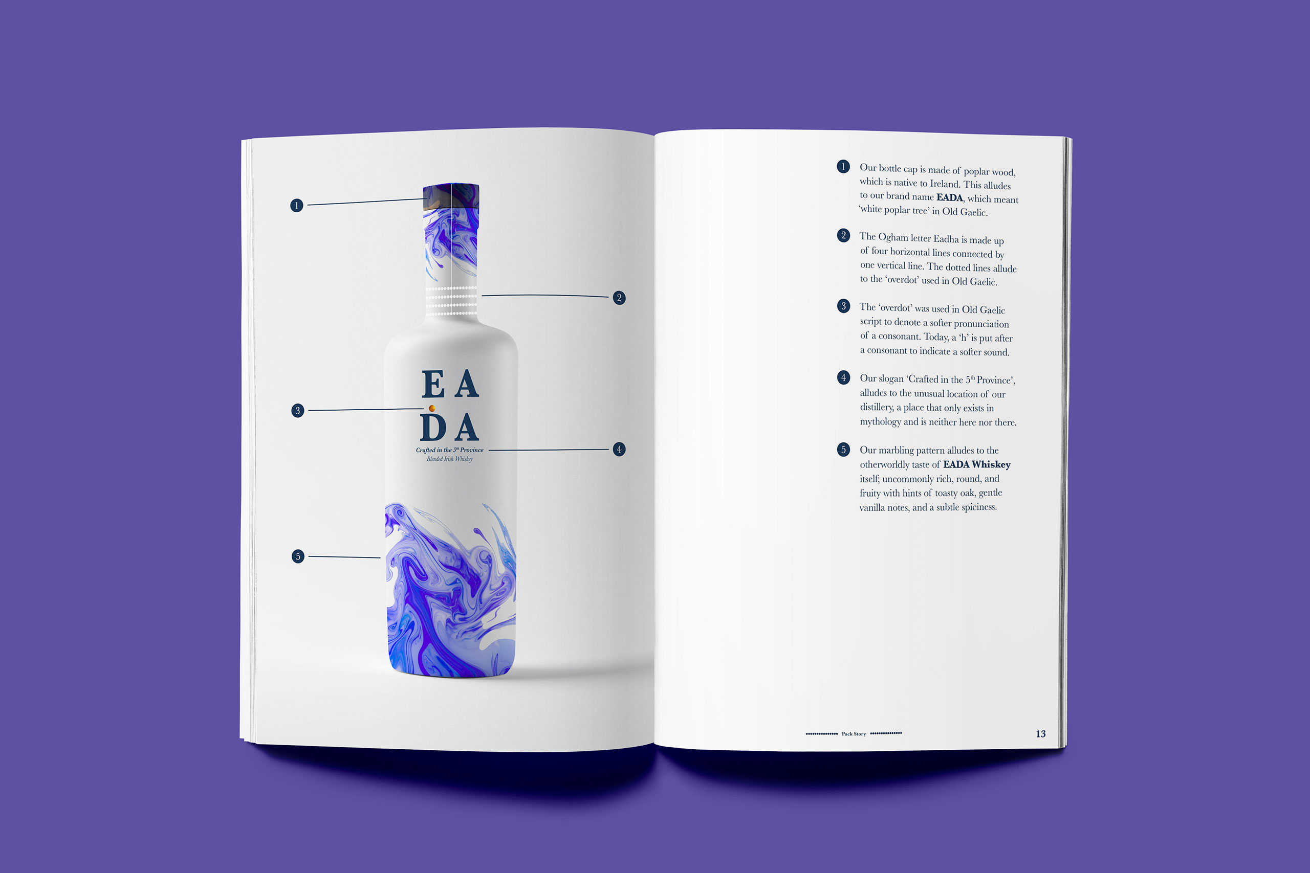
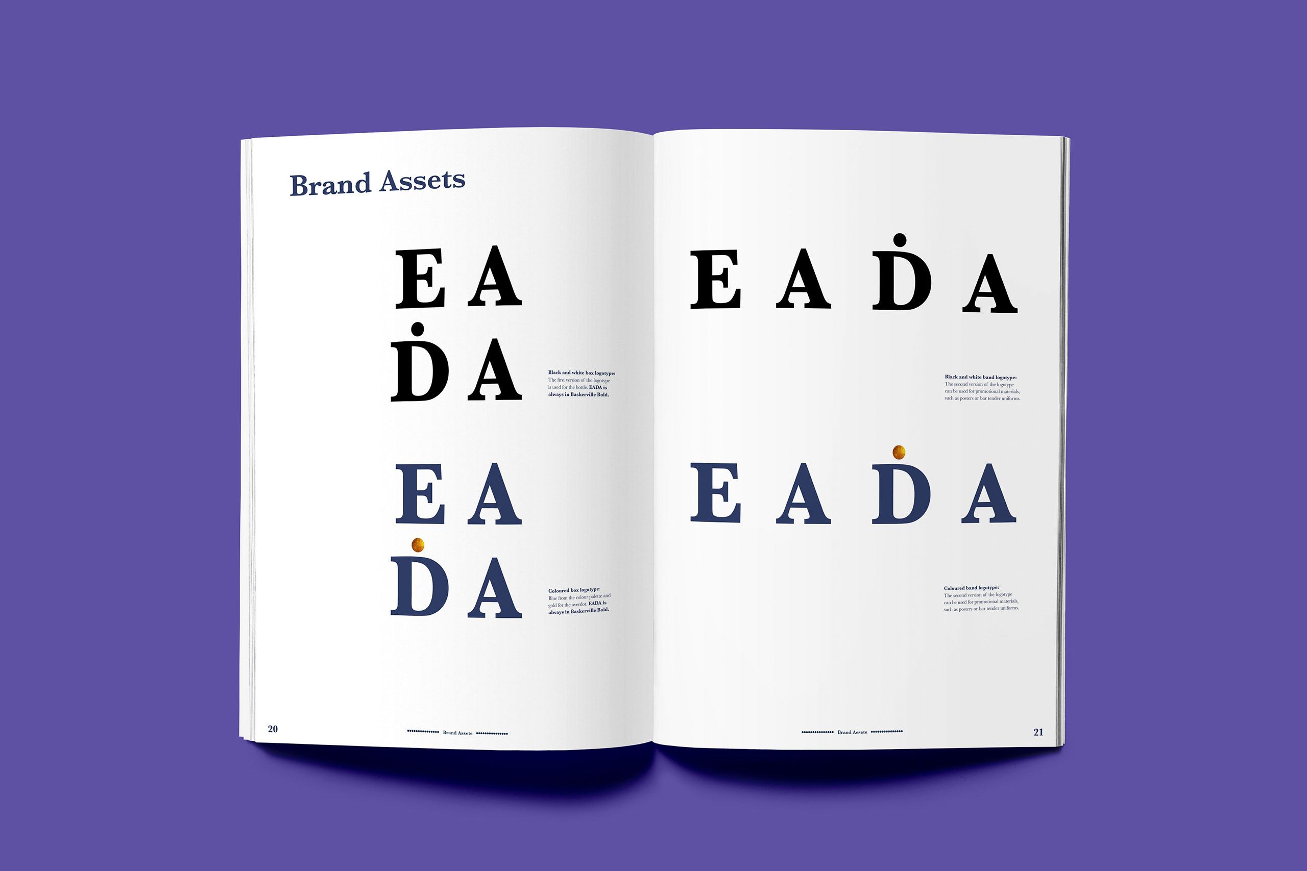
Our whiskey brand name EADA was an adaptation of the word Eadha. Initially, we weren’t sure whether to drop the letter “h” or not. On the one hand, international audiences would probably struggle with the pronunciation of Eadha. On the other hand, Eada could come across as too anglicised for a whiskey brand rooted in ancient Irish history/mythology.
Fortunately, while researching Old Gaelic script for logotype inspiration, I came across a glyph that could solve this issue. The “overdot” was a glyph that was used to indicate a softer pronunciation of a consonant, just as a “h” placed after a consonant is used to do so in Modern Gaelic. By dropping the “h” in Eadha and placing a dot over the “d”, my partner and I created a brand name that could be marketed to international audiences while still being distinctly (if subtly) Irish.
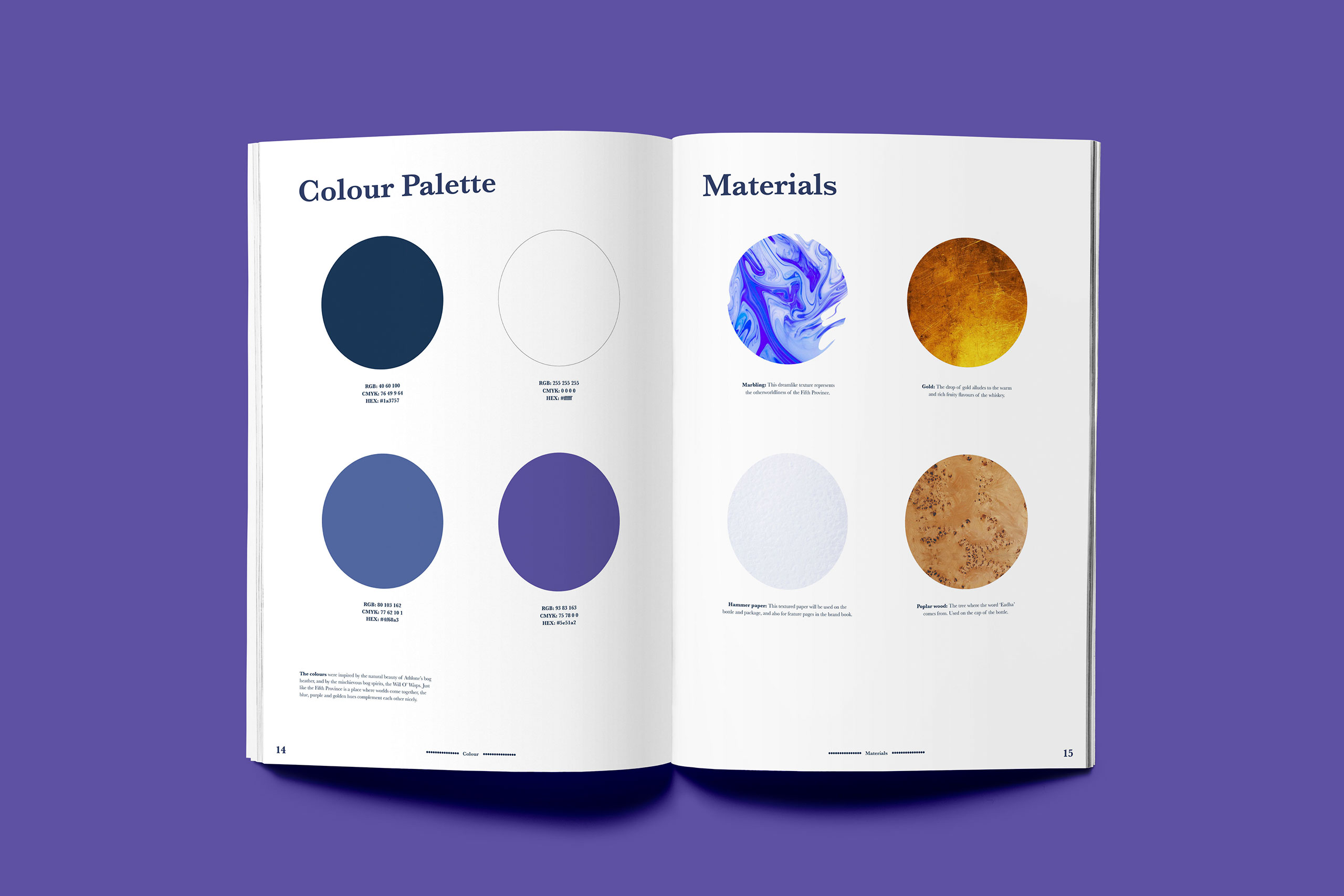
For EADA’s typeface, we chose Baskerville, a “transitional” typeface (between “old style” and “modern” typefaces), that reflected the transitional nature of the Fifth Province (between this world and the Otherworld).
Initial packaging sketches (Grace)
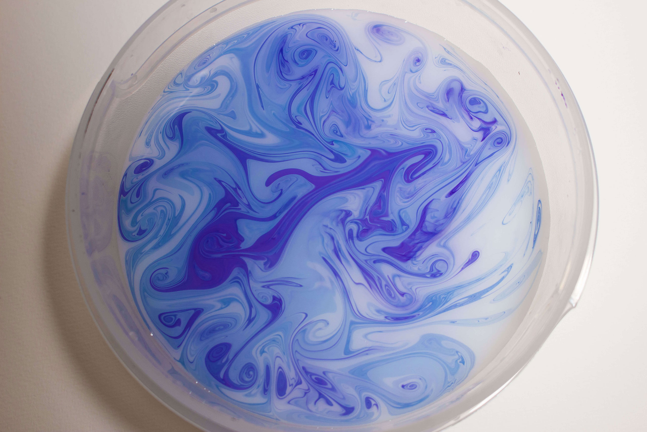
Original photo of marbling
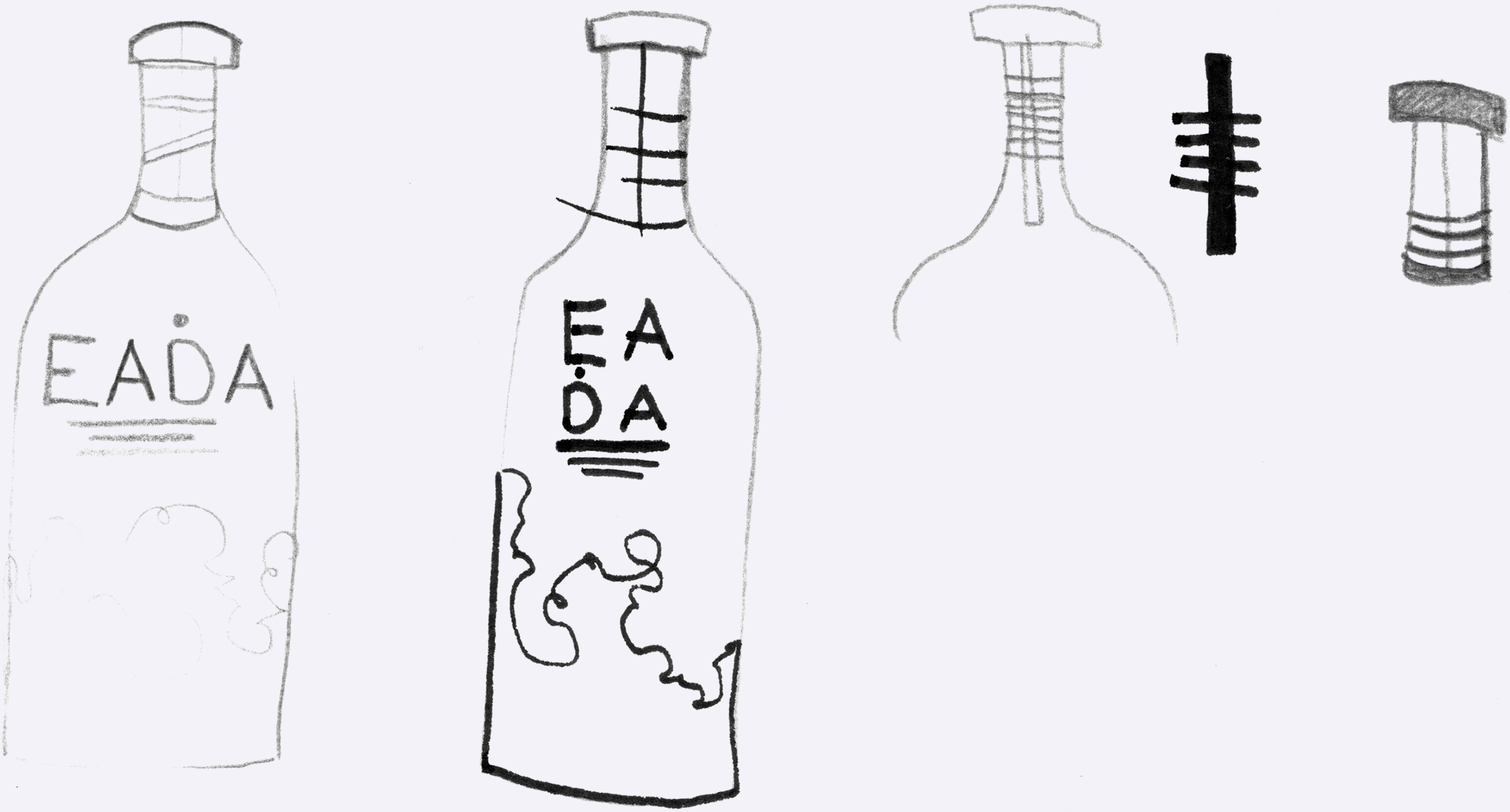
Final packaging sketches (Emily)
Pack Design
Initially, we wanted EADA Whiskey’s packaging design to be structured around the Ogham letter that inspired its name. However, a visiting representative from Bord Bia felt that this would make the design look too “rigid”, and suggested that we try interpreting EADA’s imagery (a combination of our initial, separate visual explorations), in a “looser” way.
So, inspired by the free-form art of marbling, we replaced my partner’s illustrations of Will-O’-Wisps with close-ups of coloured ink swirls in water, which alluded to the flame-like appearance of those spirits. The ink swirls then replaced the letter Eadha as the main element of EADA's packaging design.
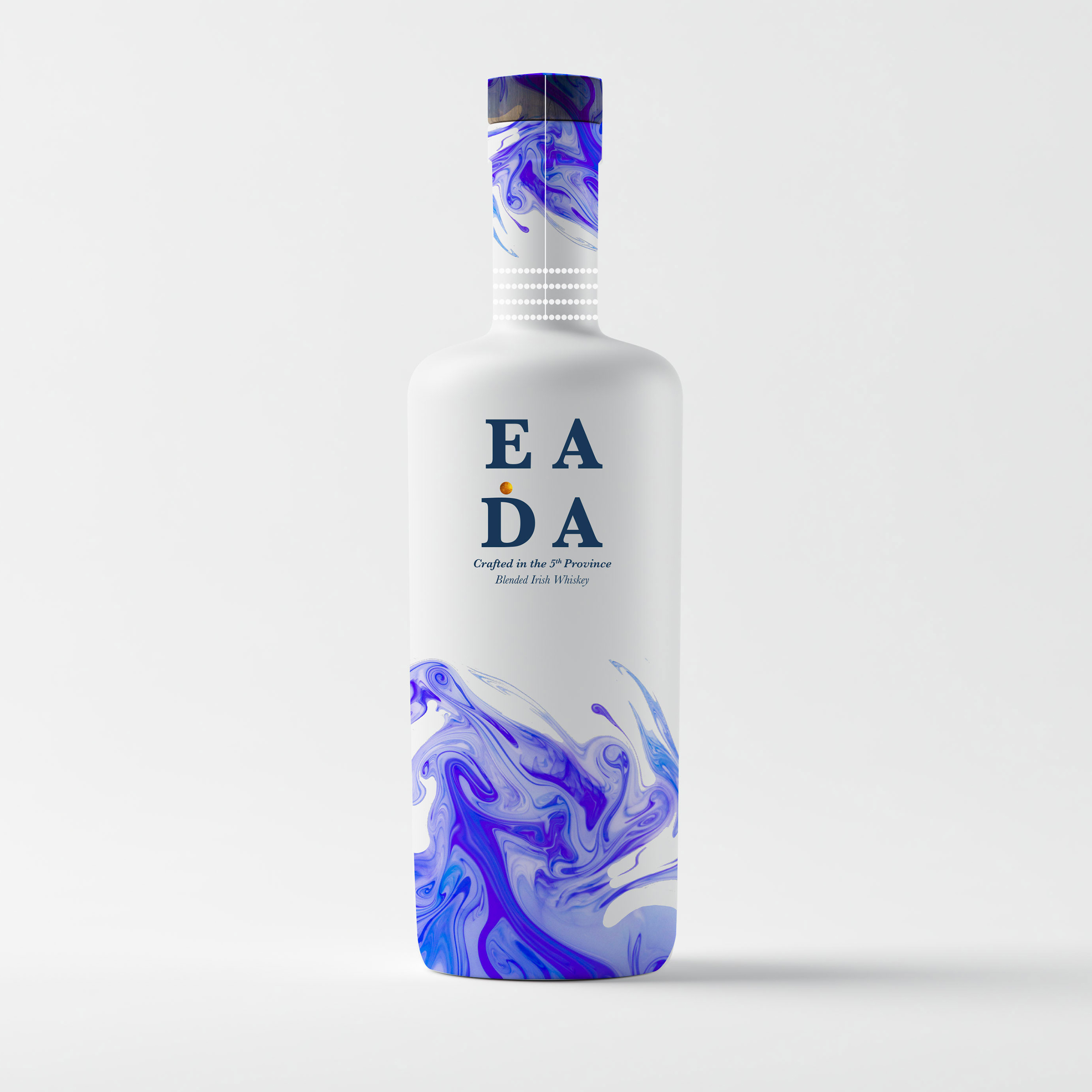
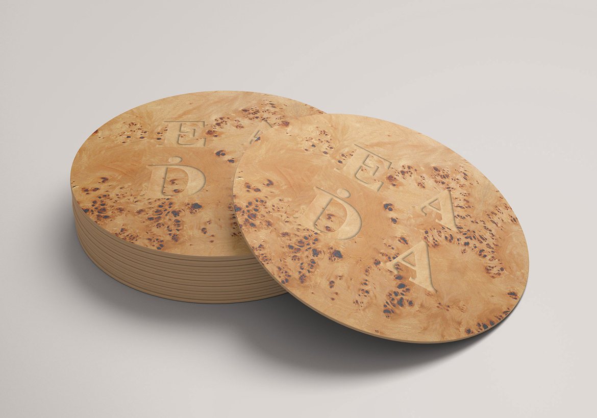
Final packaging design
Spreads from the brand guidelines